Black Apron
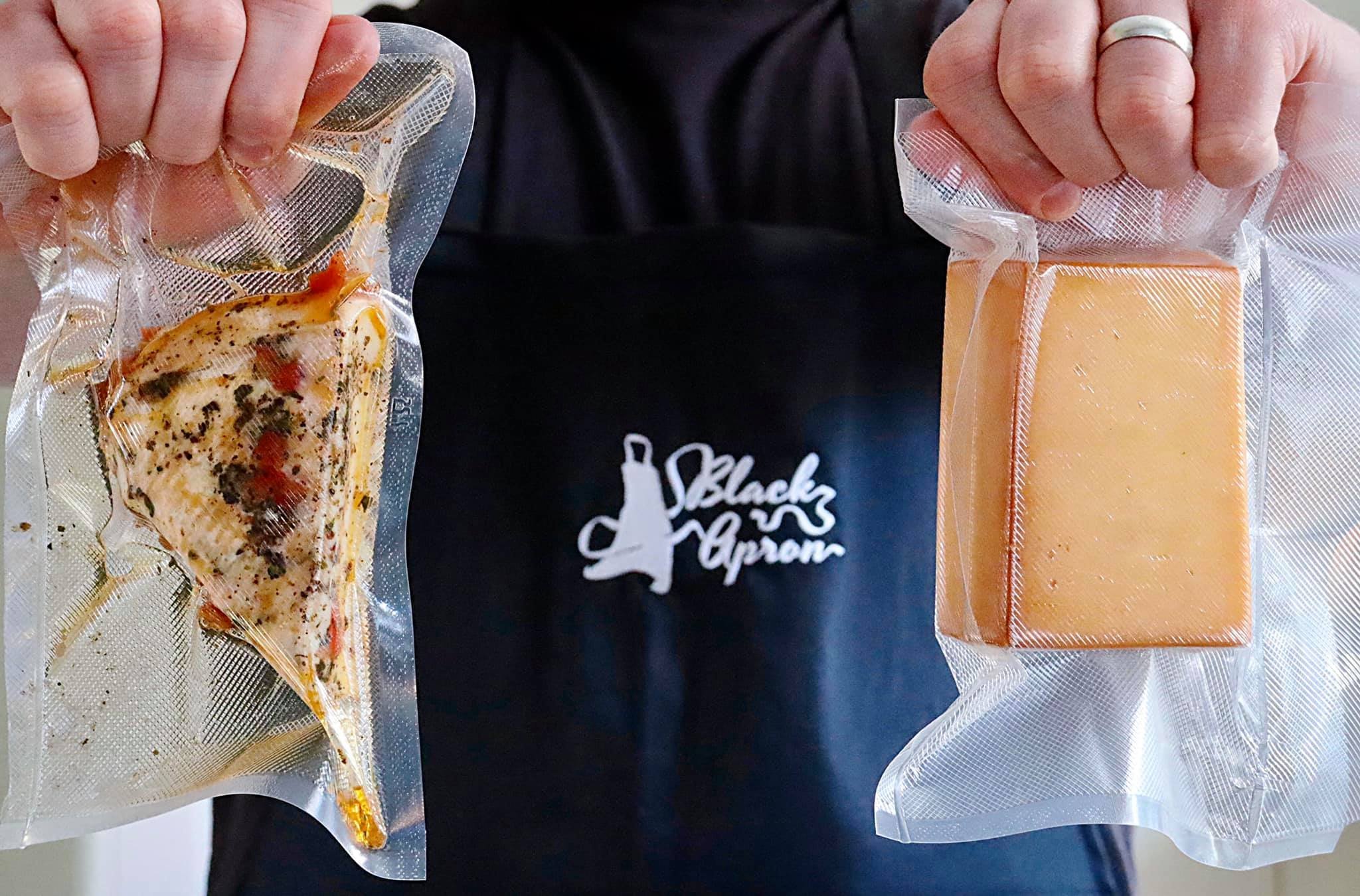
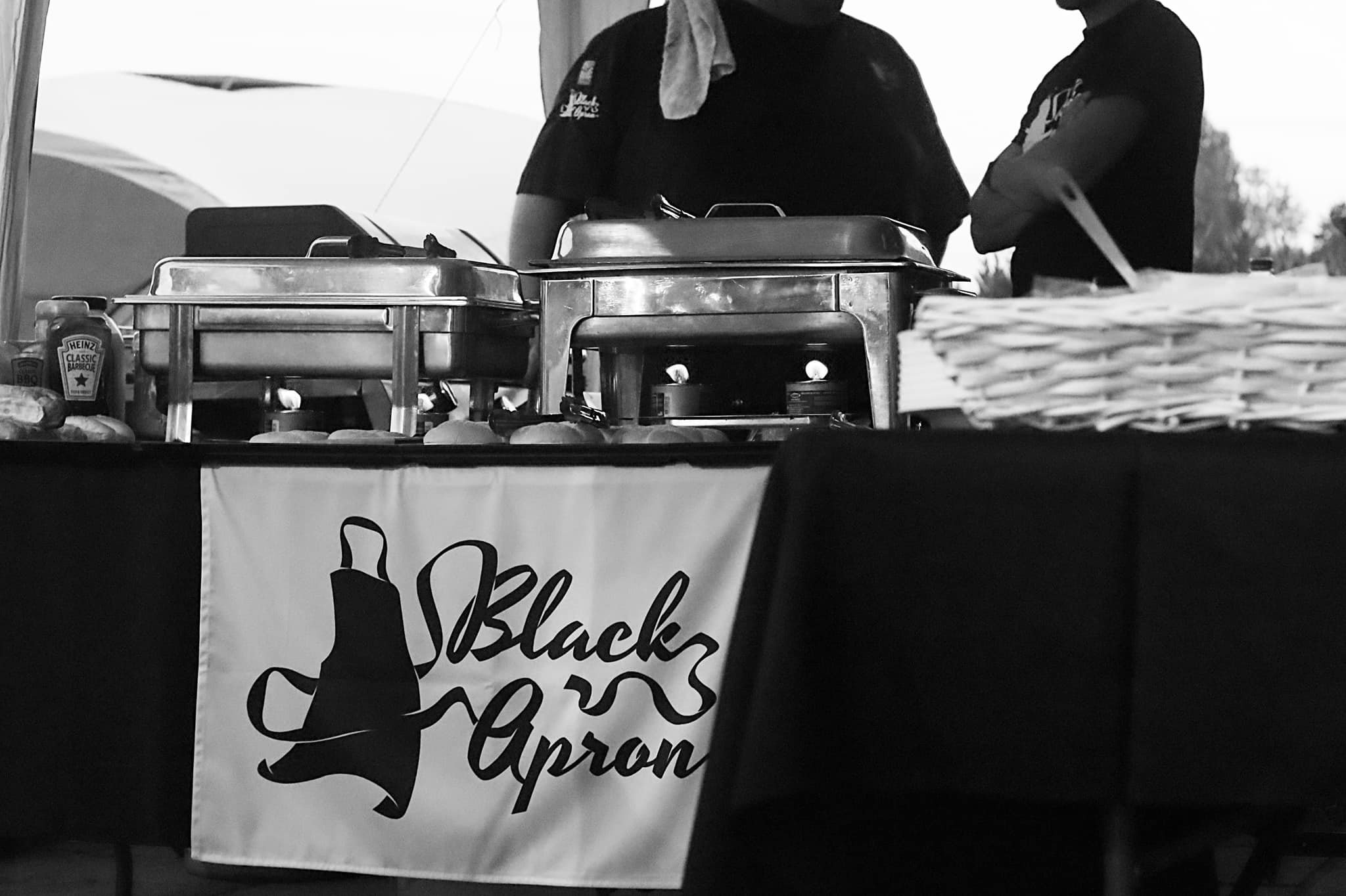
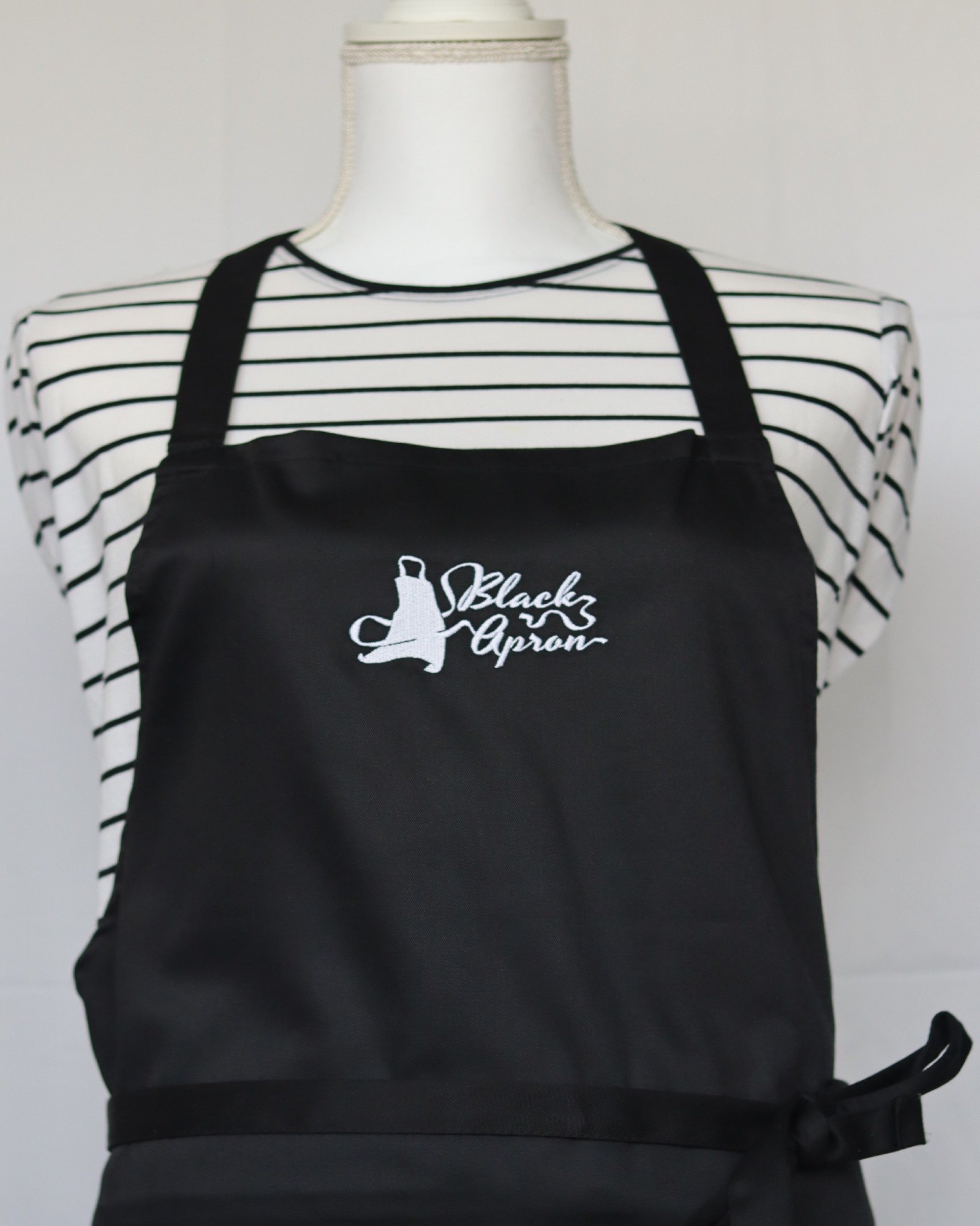
The guys over at Black Apron had a pretty good understanding of what they wanted for their branding. Simply put, a black apron with the ribbon ties forming the company name in some sort of elaborate script. Sounds simple enough, however reaching that balance of illustrative qualities and ribbon script lettering, whilst remaining legible, classy and balanced is much harder to achieve. I believe we struck that perfect balance, creating a logo that is completely unique whilst still remaining very functional and memorable.


